# 宽屏适配
uni-app-x 提供了两种宽屏适配方案,用于在不同屏幕尺寸下提供最佳的用户体验。本文档将详细介绍这两种方案的使用方法和实现思路。
# 一、页面窗体级适配
只支持web端
页面窗体级适配(leftWindow、rightWindow、topWindow)方案通过在现有页面基础上扩展额外的窗体区域,实现复杂的宽屏布局。这些区域可以独立运行、相互通信,并根据屏幕宽度自动显示或隐藏。
# 实现思路
多窗体架构
- 主窗体(mainWindow)作为应用主体
- 扩展窗体(leftWindow/rightWindow/topWindow)作为辅助区域
- 各窗体独立运行,可单独刷新
窗体通信
- 使用 uni.$emit 和 uni.$on 实现窗体间通信
- 通过事件机制传递数据和状态
- 支持实时数据同步
# 适用场景
- 需要固定布局的复杂应用
- 多区域协同工作的场景
- 后台管理系统、文档系统等
# 示例代码
# 配置示例
leftWindow等配置,在pages.json里进行。文档见
{
	"leftWindow": {
		"path": "windows/left-window",
		"style": {
			"width": "350px"
		}
	},
	"topWindow": {
		"path": "windows/top-window",
		"style": {
			"height": "60px"
		}
	},
	"pages": [
		{
			"path": "pages/index/index",
			"style": {
				"navigationBarTitleText": "首页"
			}
		}
	]
}
# 通信示例
// 发送消息
uni.$emit('updateData', { data: 'value' })

// 接收消息
uni.$on('updateData', (data) => {
	console.log('Received data:', data)
})
# 完整示例
hello uni-app使用了topWindow和leftWindow,分为上左右3栏,详见
# 二、组件级适配
HBuilderX 4.71+ 全平台支持
组件级适配方案通过将页面作为组件使用详见,结合响应式布局实现宽屏适配。该方案更灵活,适合大多数应用场景。
# 实现思路
响应式布局
- 通过屏幕宽度或设备类型判断是否为宽屏
- 根据判断结果动态调整布局
- 使用条件渲染控制组件显示,宽屏分栏展示,窄屏列表展示
动态组件
- 将页面作为组件复用
- 通过动态组件实现内容切换
- 保持状态同步
交互处理
- 宽屏模式:作为组件使用时,可以正常传递props
- 窄屏模式:作为页面渲染时,props会接收url中的参数
# 适用场景
- 列表-详情类型的页面
- 需要动态切换布局的场景
- 简单的响应式布局需求
# 示例代码
# 屏幕尺寸检测
通过uni.getWindowInfo().windowWidth监听屏幕尺寸变化或通过获取uni.getDeviceInfo().deviceType设备类型phone、pad、pc来实现响应式布局
// 方式一:基于屏幕宽度
const { windowWidth } = uni.getWindowInfo()
this.isWideScreen = windowWidth > 768

// 方式二:基于设备类型
const deviceType = uni.getDeviceInfo().deviceType
this.isWideScreen = deviceType === 'pad' || deviceType === 'pc'
# 布局实现
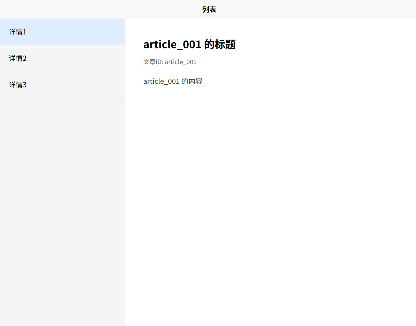
宽屏窄屏模式,通过 CSS 类名动态控制布局,响应式设计适配不同屏幕尺寸
宽屏模式:
- 采用分栏布局
- 左侧列表占30%宽度
- 右侧详情占70%宽度
- 列表和详情同时显示
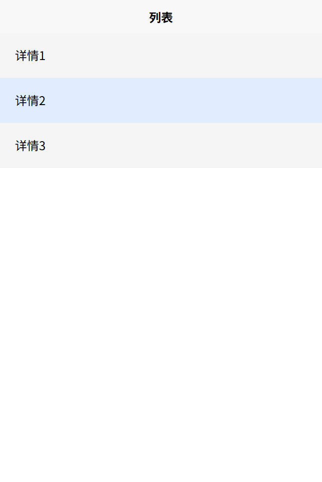
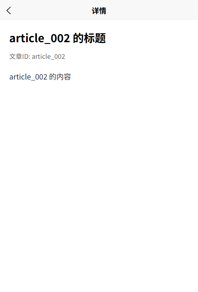
窄屏模式:
- 采用列表布局
- 列表项占满宽度
- 点击列表项跳转到详情页
<template>
	<view class="container" :class="{'flex-row': isWideScreen}">
		<!-- 列表区域 -->
		<view class="list-container" :class="{'list-narrow': isWideScreen}">
			<!-- 列表内容 -->
		</view>
		<!-- 宽屏时显示详情 -->
		<view v-if="isWideScreen" class="detail-container">
			<!-- 把详情detail页面当组件使用 -->
			<detail :articleId="currentArticleId" />
		</view>
	</view>
</template>
<style>
.flex-row {
	flex-direction: row;
}
/* 宽屏时分栏-列表 */
.list-narrow {
	width: 30%;
}
/* 宽屏时分栏-详情 */
.detail-container {
	width: 70%;
}
</style>
# 完整示例
完整的示例代码请参考插件:宽屏适配示例

